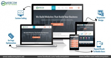

The number of people using mobile devices to access the web is increasing rapidly, which means it is important to make sure mobile users can get the best experience out of your website. But while the need to engage the mobile user is obvious, the question of how best to do so is one that every site owner will need to determine.
To date the two primary methods for handling mobile have been:
1. Dedicated Mobile Website
2. Responsive Design
The Difference Between Adaptive Design and Responsive Design
What is a dedicated mobile site?
A dedicated mobile site is at its heart a site created Wholly to serve up content to mobile users. In many respects, this is certainly ideal. These kinds of sites are designed and coded for the sole purpose of explaining particular content to mobile users.
You’ve apparently seen a site like this wherever it states “mobile-optimized” or “mobile-version” usually with a link at the bottom that shows “view desktop version” or you may notice it comprises m in the URL m.facebook.com.
Here’s a breakdown of some of the pros and cons and different applications where you should/shouldn’t use a dedicated mobile site.
Dedicated Mobile Site Pros:
Customized Experience – a custom experience that drives to happier visitors.
Inexpensive – on small scales, there are some tools out there to automatically provide a mobile-optimized experience (Duda Mobile).
Marketing – It’s become clear that search engines like Google are rewarding websites that custom-tailor experiences for each audience and give the best experiences. You may see a hike in search of traffic by implementing a mobile-optimized experience.
Sales – providing a fully customized experience around a particular device or screen size can help start the process of purchasing easier – particularly in high volume situations.
Exacting – Can offer more control for designers and developers that don’t want to deal with various screen sizes.
Dedicated Mobile Site Cons.
1. Expensive – Building a completely distinct set up for mobile users through a dedicated mobile site can be costly – not to mention you’ll want to consider not just for the smallest smartphone screens, but also the largest Tablet screens as well.
2. Upkeep – Holding your website up-to-date is previously challenging enough. If you have a dedicated mobile site, it could mean building 2 or more copies of everything.
What is a responsive mobile site?
As opposed to a strictly “mobile-website” a responsive (sometimes called adaptive) site enables websites to be inspected on various mobile devices and screen sizes. As the name indicates responsive sites “respond” to the device, they’re on shifting and scaling based on the device screen size. Responsive design is the preferred option of Google(https://developers.google.com/webmasters/mobile-sites/). Google has made it clear that it will start rewarding websites with higher Search Engine Result Page (SERP) rankings. But there are still some pros and cons to consider when discussing responsive sites:
Responsive Website Pros:
1. Automatic – More frequently than not one website (when done with “responsive-design”) is all you’ll require handling all devices, meaning far less time with upkeep.
2. Marketing – It’s become apparent that search engines like Google and are rewarding sites that custom-tailor experiences for each audience and give the best experiences. You may see a hike in search of traffic by executing a mobile-optimized experience.
3. Less Expensive – Over time, particularly if you’re producing a site today responsive is typically built into most development companies processes and should be painless/cost-free to maintain.
Responsive Website Cons:
1. Redesign – Since the responsive standard is still relatively new, many websites that are 3+ years old apparently aren’t responsive and may require a redesign or retooling to work.
2. New/Flexible – This is partially for designers and partly for the businesses considering responsive, because of the “flexible” nature of the responsive design it means design practices are new.
At Bottomline:
At Webcom the decision has been simple. After the Bootstrap 3 (mobile-first) framework came out, we’ve been building every new site with responsive design. It’s proposed a change internally on design thinking, execution and testing – but it’s what makes sense for 99% of our clients.
What are your choices? Is there anything I missed? Please feel free to leave a comment or ask any queries, and I’ll be sure to answer.